Time to read: 8 min
It’s one thing to design a product that improves the way something works, makes things fun, or helps you explore new ways of doing things. It’s quite another to change routine, daily behavior, like typing or using a keyboard.
That’s the challenge Gest is taking on.
Gest is, in the company’s own words, a digital toolkit for your hands that allows you to work in a more intuitive way. Translation: dump your keyboard and let your hands do the interacting.
In this Spotlight, we sit down with Gest’s CEO Mike Pfister to chat about the challenges inherent in driving a sea change in the way people interact with their computers and mobile devices.
Identify the Problem, Not the Product
One of the things Mike learned early on was that if you’re going to change people’s lives, you can’t start with the product. You have to begin with answering this question: what issue or problem do I want to solve for people?
The physical devices people use to interact with computers vary: you can use a keyboard, a mouse, or a stylus. (We’ll leave voice-activated commands out of it since voice isn’t a device, and the hand still reigns as the primary body part we use to directly interact with our computers). The kinds of interactions also vary: you can type, click, drag, or draw, to start with.
Because typing is our most ubiquitous type of interaction with a computer, and the keyboard the most utilized device, Mike and his co-founder Sid started there.
“For us,” says Mike, “our realization was that typing on mobile phones sucks. Productivity decreases with the screen size. We want devices like the Oculus Rift to be fully functional computers. But for this new transition to VR to occur, we’ll need a new way of input. So we started working on the typing use case.”
The Gest team put together a basic web site, which was posted on Hacker News and… “it went viral,” says Mike. “It just blew up. We realized, people really do want a new way to be productive.”
Finding the Lowest Possible Barrier to Entry
Once you have the problem defined, the next step is to determine the approach you’ll take to solve it. For Gest, the very nature of the problem they sought to solve defined its own answer: put the user first, from an interaction as well as a form factor perspective.
The co-founders were realistic about the challenges they were up against. “It’s really difficult to change user behavior,” explains Mike, “so the approach we took initially was to have Gest learn the way people type rather than the other way around. The barrier to entry had to be as low as possible.”
But even that approach proved to be tougher than the team had hoped. Watching “lots of people use keyboards,” they saw that almost everyone typed differently: there was the traditional hunter and pecker, the hybrid typist, even the “opportunist” typist.
Realizing that creating a compelling user experience on the keyboard was going to be practically impossible, they stepped back a bit. “The complexity involved in creating a singular user experience that could encompass all of the different typing styles was just too time-consuming for a first product release,” Mike tells us. “Typing requires an infinite amount of input to be correlated with an infinite amount of output, and that gets pretty challenging. Non typing commands are easier to tackle from a software perspective because they hold consistent meaning across users. So we shifted our focus to creative designers—because of all the non typing commands they use on a daily basis.”
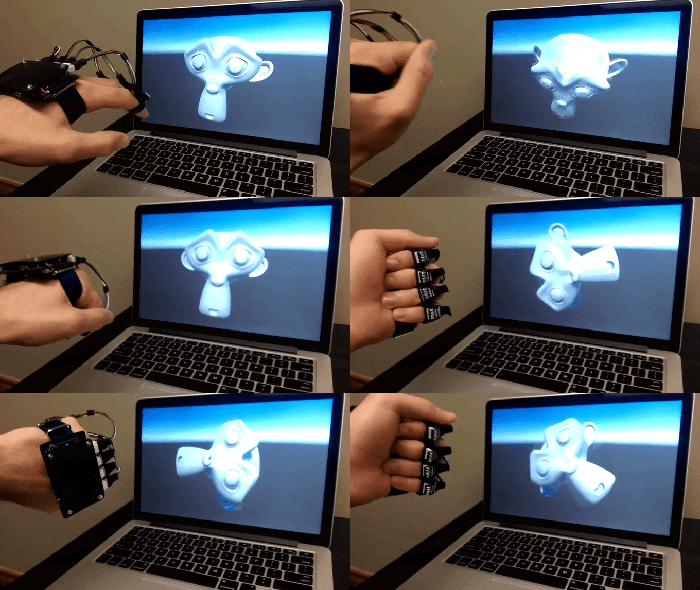
“Designers are invaluable as a first test group,” Mike adds. “The main app we’re supporting is Photoshop. We’ll have tutorials and release general software for Windows and Mac that will allow people to assign custom gestures from the keyboard and train their own custom gestures.”
Even more importantly, Gest feels that the progress the company makes with designers today has significant implications for everyone else tomorrow—primarily because creative professionals have an ultra high standard for a great user experience and are willing to provide the feedback the company needs to build that UX into their product.
The Ultimate Goal: Redefine the Human-Computer Relationship
On the other side of the equation, Mike and Sid saw that most companies working in their area were focusing too closely on the technical problem of tracking the hand, without seeing the bigger picture. If you’re going to change the way people do something, especially if that something is a deeply entrenched habit like typing on a keyboard, you need to push in a lot deeper.
“[Two of the companies we looked at] only use motion sensing,” says Mike, “and their devices only support five hand motions. We wanted something a lot more sensitive.”
The Gest team wanted to learn what the implications of those hand motions are and how the device can learn from them. In other words, how to enable a positive feedback loop for both the user and the device—drawing them ever closer into a meaningful relationship. Without that relationship, behavior change isn’t going to happen.
Gest sees this relationship as front-and-center of the company’s very raison d’être: “We want to be the software layer of all human-computer interaction. We have hardware and software that gives us a really high fidelity of data, but the real challenge is figuring out how to use that data to build a user interface that’s intuitive and productive. Because that’s what’s really important: understanding the reasons for specific hand motions and designing intuitive user interfaces.”
Sid agrees. “All the issues we’re currently facing,” he says, “lie in designing a fantastic user experience, more than the technical side of things. The iPhone certainly wasn’t the first smartphone, but it was the first to have a truly intuitive UI designed from the ground up, and that took smartphones mainstream. Our work at Gest is going to be equally important for securing the mainstream adoption of smartglasses and VR.”
Does This Glove Make Me Look Nerdy?
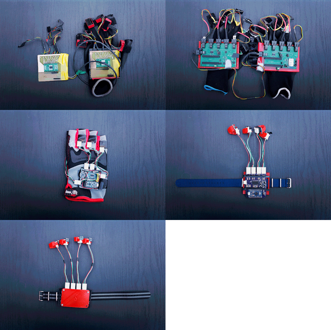
From a form factor perspective, the Gest team started out the same way everyone else working on a hand-computer interface starts out: with a glove.
Because a wearable device for the hand has to, well, fit like a glove. But in order for this device to make people abandon their keyboards, mice, and stylus pens, it also has to be light, comfortable, intuitive, and barely-there. Yet most of the hand sensor devices out on the market today are essentially large, clunky hi-tech mittens.
“We looked at Power Glove and other more recent finger tracking systems,” says Mike. “A lot of people shrugged the glove off as a nerdy power-user plaything. We knew we had to get away from the creepy look, keep it as simple as possible, but still collect robust data.”
As soon as the Gest team saw users were not enthused about the glove form, they took all that off the table and started from scratch—to design a much lighter wearable that looks nothing like a glove, yet still works like one.
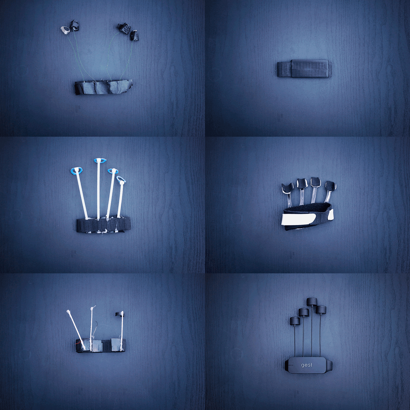
First, they knew the sensors had to be on the fingers, so they placed them at the most data-producing spot: the tips of the fingers, where the sensors get the greatest amount of movement and motion.
But attaching the sensors from fingertip to the main hand unit once again turned the device into a glove-like form.
“So we put the sensors in the middle part of the finger,” says Mike, “and that was a good compromise for comfort, universal fit, and quality of data. The big challenge was coming up with a design universal to all hand types and sizes.”
The team tried out all kinds of materials and finger link sizes, and different ways of attaching the wires to the main unit. The early prototypes were a bit rigid and required molding the sensor units to a person’s fingers. The other problem was durability: the handmade prototypes would break easily, especially at the connections between the finger mounts and the main unit.
“Our team studied various kinds of plastics with different smoothness, thickness, and flexibility,” shares Mike. “Ultimately, we selected materials that were comfortable, stylish, and durable.”
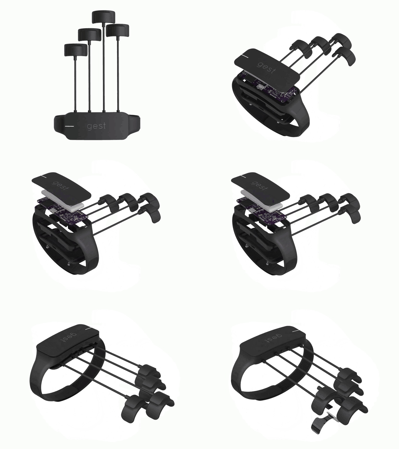
The end result? An elegant, lightweight, fully functional device with moldable plastic/aluminum half-ring finger mounts you can shape to your fingers and snap on and off. All the electronics sit in the main unit on the back of your hand while the strap is all you have on the palm, so you retain the full utility and mobility of your hands without feeling like you’ve got a brick attached to them.
What if It Breaks?
One of the fastest paths to failure for any new product, much less one that purports to change user behavior, is poor quality. Durability and reliability may not be as visible and sexy as the colors and design of a device, but if yours doesn’t have them, you kill the relationship for your user. Think about the stellar reputation Apple has had since the early days for their relentless attention to quality and durability.
In the case of Gest, a device with thin wires and lots of movement constantly stressing the various parts, durability was top of mind for the team. Mike shares: “We thought about what are some of the most common household electronic accessories that go through a lot of movement and flexing: earphones and USB cables, of course! So we worked out the right amount of durability and flexibility for the wires, and put in extra protection around the connection points between wire and PCB.”
And because any material will eventually wear out, the Gest team designed the finger sensors and wires so users can detach and replace them one by one as needed.
The Stakes for Change Are High
The reason why all of these aspects of creating Gest are important—and the reason why the company spent so much time tweaking and refining every last minute detail—is because changing a person’s relationship with an existing device is harder than establishing a completely new relationship. It’s the reason we were so enamored of those early computers, despite their beige-green plastic box look. It was our first time with a PC. Today, spoiled by a highly evolved fusion of design and functionality, we are a much more sophisticated and demanding audience.
Keyboards today are sleek, thin, and ergonomically designed. Mice are wireless. Stylus devices are even more elegant and sensitive. Everything is plug-and-play. So why should people use something as different and game-changing as Gest?
Because there’s a new transition on the horizon: the shift from keyboards and mice, sleek though they may be, to a more intuitive way of interacting with mobile and AR/VR devices.
“We believe the future of computing is in wearables,” says Sid. “We think people are going to have to use something like Gest because the mouse and keyboard aren’t going to work with these devices.”
These days, we’re used to a near-vertiginous rate of change in the tech industry and tend to adopt new technologies and new ways of working with less friction than in previous decades. Still, changing the way we interact with the most pervasive device of them all—the computer, whether desktop, mobile, or wearable—is a challenge that will take time, persistence, and lots of user feedback.
