Time to read: 3 min
For those new to hardware development, product design can seem like an abstract, enigmatic, and intimidating process. You present your ideas to a room of industrial designers and engineers, and you hope they understand and respect your vision enough to help you create a successful product. It can be a stressful experience; after all, you have investors to think about; and you might be financially invested in your company, as well.
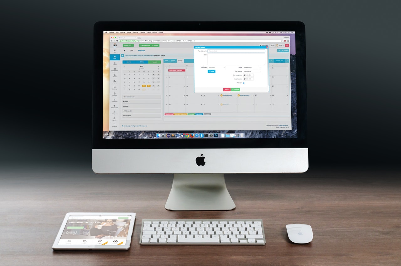
In this situation, it might seem like a safe decision to borrow design elements from existing products whose brand identity you’d like to emulate. The most common request we hear stemming from this is to “just make it Apple White.”
We get it. Copying Apple’s design aesthetic (or that of other well-known hardware companies) seems like a direct path to success. After all, Apple is king when it comes to perceived quality, so why not follow in their footsteps? The truth is much more complicated, but at the heart of it lies this simple fact: You aren’t Apple.
Let’s look carefully at the history of Apple’s visual identity and then talk about product design strategies you can use to create a fresh visual identity for your product.

What is Apple White?
Let’s take a step back. Using Apple as a case study, what is Apple White, where did it come from, and how has it become the epitome of product quality?
In the late 1990s and early 2000s, Apple design chief Jony Ive was exploring product concepts for the iPod. Ive pushed for the iPod to be color-neutral, using stainless steel and white plastic, partially as a reaction to the colorful iMacs of the 90s and partially because of his own obsession with designing in white. There was a wrinkle, though: Steve Jobs hated it.
To appease him, the design team had to come up with a collection of off-white shades. The color we now take for granted as “Apple White” is in fact called Moon Grey.
This is a story of developing brand identity through an iterative creative process. It’s contextualized firmly in the history of Apple, and it didn’t happen overnight.

Using an iterative creative process to develop a visual identity
As product designers, it’s our job to go through the same process with our clients to find the right solution. Defaulting to Apple White or any other low-hanging fruit undermines your product vision, the experienced designers you are paying, and is potentially damaging to the success of your product.
Successfully copying Apple hardware design is extremely challenging. Starting with the fact that Apple White is proprietary (sorry, no Pantone numbers here), Apple products look as good as they do because they are fabricated using very expensive processes made affordable by very high volumes. Your discount contract manufacturer has limitations, and you will be better off working within them.
So what should you do, as the hardware lead, to navigate these murky waters?
Tips for creating a unique visual identity for your product
Here is what we recommend:
1. Listen to your product designers. We have years of experience learning from projects and clients, so we have a deep understanding of the ingredients that make a good product.
2. Ask questions. This process is collaborative, and we want to make sure you understand the decisions we make and why.
3. Describe personality over looks. If you tell your designers how something should look, you’re doing their job for them. Instead, tell them how it should be perceived (rugged, sleek, industrial, approachable, simple, etc.).
4. Provide other examples. Just because you shouldn’t copy doesn’t mean you can’t find inspiration in other products. Collect interesting examples and think about what you like and don’t like.
5. Understand your limitations. Design decisions are greatly impacted by your development budget and your schedule.
For example, you may have all the money in the world, but you need to deliver your first run of units in two months. That means the design direction will be shaped by the limitations of a faster manufacturing process, like urethane casting over injection molding.
6. Trust the process. This is a learning experience. Get samples and make prototypes. Nothing is ever perfect on the first try.

