Time to read: 9 min
Steve Jobs once said, “You can’t just ask customers what they want and then try to give that to them. By the time you get it built, they’ll want something new.” Apple makes beautifully functional—and functionally beautiful—products that people are passionate about and cannot seem to live without. The company would famously keep all of their product development under fervent lock and key, to unveil it in grand dramatic form to legions of impatient fans.
Many strive to emulate this approach to product development. But not everyone agrees it’s The Way. Handground, an unassuming new startup in the coffee grinder space, stands Mr. Jobs’ philosophy on its head and feels its products are all the better for it. Our question is, how do you wrangle a vastly disparate group of people scattered all over the planet, with all of their varying opinions and preferences, and come up with a product that all of them love?
In this conversation with Daniel Vitiello, co-founder of Handground, we learn how to leverage the power of the crowd effectively and avoid some common pitfalls of crowdsourcing.
The Devil’s in the Data
We asked Handground how and when it occurred to them to harness input from community to make the perfect coffee grinder. Their answer: “It all started with the company name.”
“We had a name we liked,” says Daniel. “Kaizen. Kaizen is the Japanese philosophy of continuous improvement.”
We ask him to spell it. He nods knowingly: “Exactly—it’s hard to spell. We’d read a blog post about using Amazon’s Mechanical Turk to iterate company name ideas. So we gave it a shot: we recorded a string of names as an audio file (the names were Kaizen Coffee, Handground, and Zen Coffee) and asked people to type in the names as they heard them, and share what imagery came to mind for each one. We learned a lot from that experiment, even with just 100-200 respondents. We learned that Kaizen was hard to spell and that it brings up all kinds of associations with German companies for people. And we found that ‘Handground’ was the easiest to remember.”
Daniel and fellow founder Brandon Warman got so much out of this first survey, in fact, that they started wondering whether they could apply the approach to product development. “When it comes to objective things like production time, material costs, and shipping,” says Daniel, “that’s not a matter of opinion but rather functionality. But all the subjective decisions, like aesthetics, design, materials, pricing strategies, all that you can test really early on by involving people and asking them questions.”
We might as well say it out in the open, from the start: the sauce is in the data. Data before you touch a single design tool, data to help you determine the ideal material, data before, during and after every single phase of product development. Perfectly crunched data has been the mantra of Handground the way coffee lovers appreciate perfectly ground beans.
So let’s drill down into the ways Handground engaged, and harnessed, the coffee lovers community to come up with not just a great product, but also a highly successful crowdfunding campaign to make that product.
Finding Your Community
Having a large email list is great, but having a large email list of people specifically interested in the thing you’re making, or setting out to make, is orders of magnitude better.
Inspired by their experience with Mechanical Turk, the Handground founders turned to it again to seed their community. “We ran our first product survey in October 2014,” says Daniel. Not wanting to skew responses by revealing the type of product they were making, the founders instead asked people to describe their relationship with coffee and why they are interested in collaborating with a startup making a new coffee “gadget.”
“For these open-ended replies, we used a weighted scoring system and categorized the responses. We took the top 30% [of respondents].” But because Mechanical Turk charges $0.25 per survey response, which can add up really fast, Daniel and Brandon turned to another Amazon world: user reviews. “We read reviews of other coffee grinders being sold on Amazon,” Daniel shares. “We would comment on the comments, letting those people know we’re working on a new grinder, and invited them to join us. That way we found people who were motivated by a natural passion rather than by payment from Mechanical Turk.”
Instagram was another source: “We shared what we were doing, posted updates, and liked and engaged a lot on that platform.”
As everyone knows, having a person’s email is worth your product in gold. But between the survey, user review comments and Instagram, Daniel and Brandon still only had about a thousand email addresses. Not enough to launch a respectable Kickstarter campaign. So they did a pre-launch campaign that “exploded our email list.” Tools included Harry’s open source Prelaunchr that the guys modified to use a lottery reward system and online surveys to determine what prizes the community wanted.
“Our message was, ‘if our Kickstarter campaign is successful, we will give away the first 25 grinders we make—so go to our web site and sign up to register to win!’ Signing up with your email gave you one entry, but if you shared our message on Facebook, that got you ten additional entries, plus an additional five for every friend who clicked on your unique URL. Then we manually DM’d all five thousand of our Instagram followers. That converted hugely because we were already connected, so there was existing trust there.”
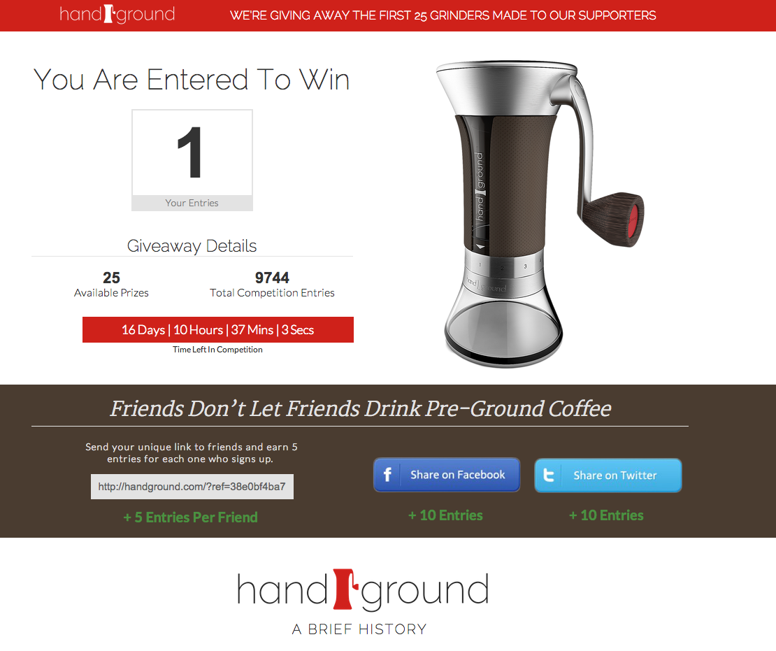
The pre-launch campaign went viral, and Handground’s email list shot from 1K to 7K in the course of a month. When Daniel and Brandon launched their Kickstarter campaign in February of 2015, they launched to a much larger list. That community came to be called Team Handground (TH), and that was the community that took the campaign from zero to $308K in a matter of 18 hours.
Drilling Down to Core Features
When you’re designing a new product—one that serves a specific function or purpose as opposed to a pretty decorative item—the idea is that you’re addressing a pain point for a specific audience or type of user. But how do you determine what that pain point is if you’re not steeped in the industry or field?
You can take the effort-intensive route, read lots of books and interview hundreds of people. Or you get innovative about it and scrub data from sources where that information already lives. Daniel and Brandon did just that: while they were “commenting on comments” about the coffee grinders offered on Amazon, they also took notes on the issues and problems people had with their machines. As it turned out, the founders had experienced the same problems themselves, but they wanted “validation from the community,” says Daniel.
The next step was to think about the features their grinder would introduce. For example, people might want to store their coffee beans inside the hopper, but how do you keep them from going stale? That would require an airtight hopper—a feature the community ended up voting against, saving the team unnecessary time and money they might have spent, for nothing.
“We really wanted to understand what people’s habits were when it came to grinding coffee, what the pain points were, and how the features we integrated into our grinder would solve those pain points,” shares Daniel. “So we created a list of constraints—which features we would include and why, which ones we wouldn’t and why. In our next series of surveys we asked people why they did what they did; things like, ‘do you use a scale,’ ‘how do you measure out the beans,’ and so on.”
Next step: design.
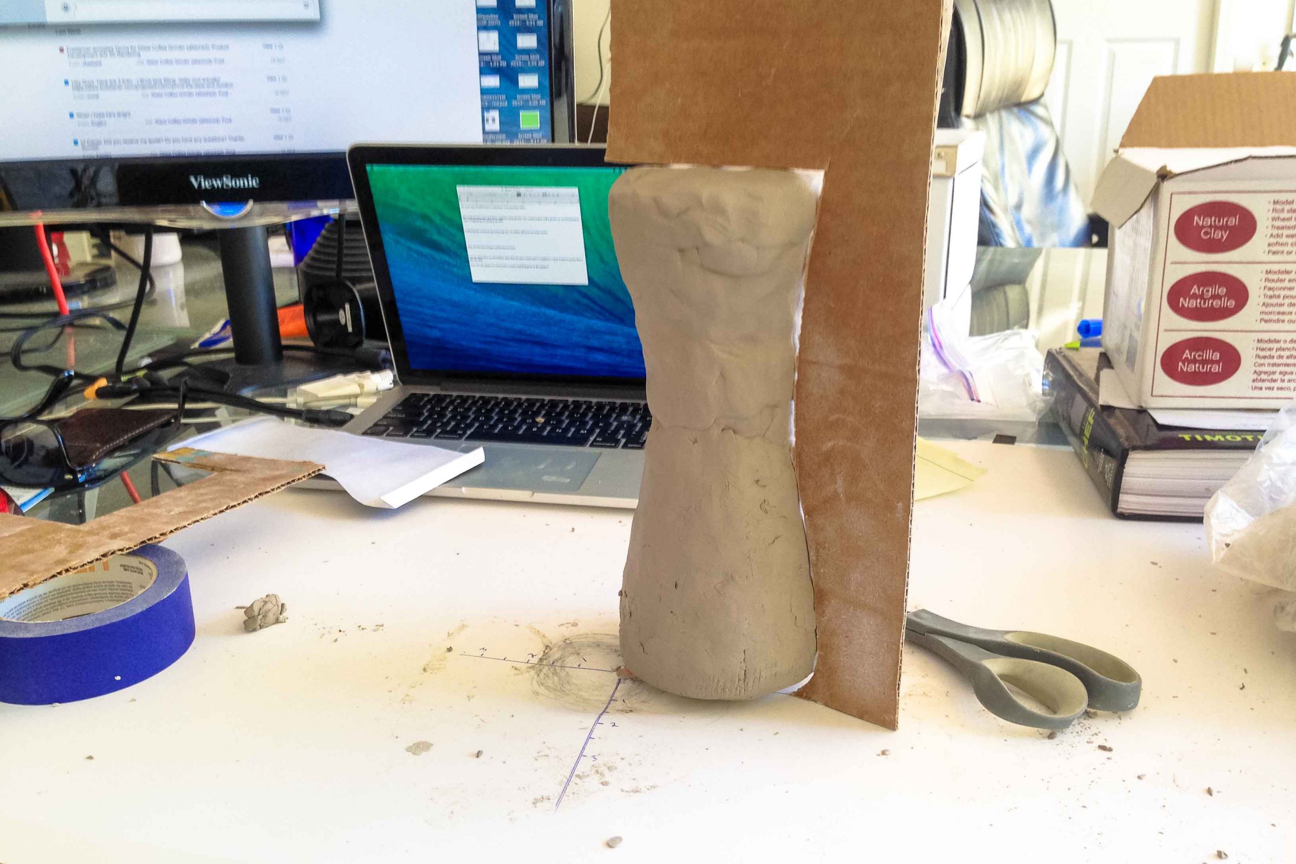
“We’re not designers. We didn’t know how to do 3D modeling in CAD, so we worked with a contractor and developed an initial model,” says Daniel, “But we weren’t happy with it aesthetically, and Team Handground didn’t like the handle. We didn’t have the funds for a high-end product designer, so we turned to crowdsourcing and held a competition for a new handle design on 99designs.”
But they soon realized, after viewing the initial design submissions, that a platform like 99designs is best for graphic design, not for 3D product design; so they found designers on Behance.net and GrabCAD and invited them to the design competition. “What surprised us,” shares Daniel, “is that 90 percent of the entries were for the entire grinder, not just the handle. We hadn’t even considered that. Some of the designs were really good. So then we showed the top 50 entries to Team Handground, which narrowed it down to six finalists. We passed the community’s feedback to the designers, who then resubmitted their designs. And then Team Handground picked the final design.”
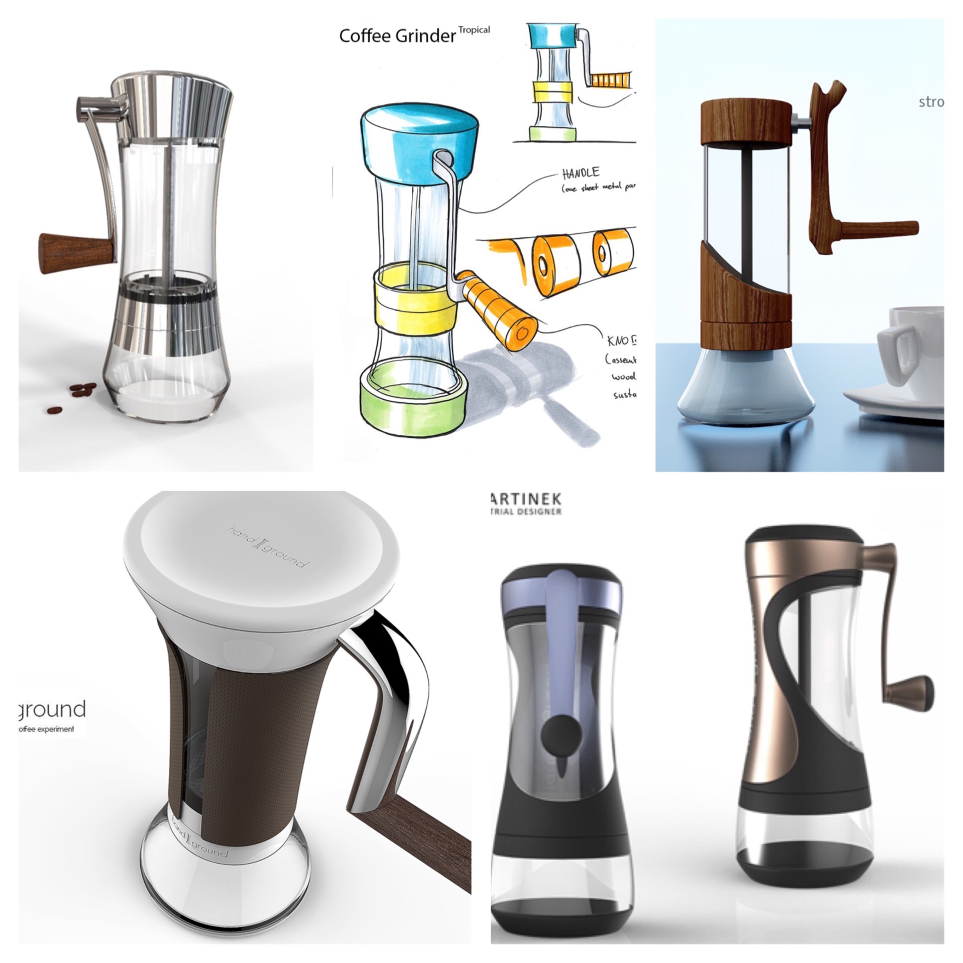
Daniel and Brandon did not vote. Yes, that’s right: the founders of Handground had nothing to do with choosing the final design. Product design blasphemy? Maybe not. For the founders, the reasoning was simple: “Our thought was, they’re the customers who will purchase the product, so we let them choose the design they like.”
When the Community Is ‘Wrong’
As we have seen, input from the community works best when subjective matters are at stake; not so much so when it’s a matter of objective fact. The Handground founders experienced this first-hand when they were deciding on the gear ratio.
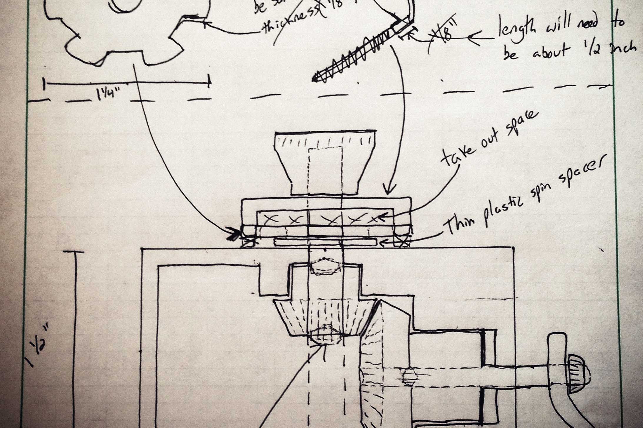
Most coffee grinders on the market have a vertical axle and no gears, with the handle mounted directly on top of the axle. Reason? Because it’s cheaper and easier to do—designing a gear box is a difficult process. The Handground grinder, however, had a side-mounted handle, which called for a gear box.
“Initially,” explains Daniel, “We thought we’d have a 2:1 gear ratio for the handle, since that’s what the community wanted. Grinding coffee manually takes a long time, so the 2:1 ratio would give us a faster grind time—as long as it didn’t take too much effort to turn the handle. But when we tested it, we discovered it was indeed too hard to do physically, to turn the burr mill. When you double the gear ratio, you’re doubling the force required to turn the handle. So in this instance, what the community wanted wasn’t feasible, and we could say that objectively.”
Needless to say, Handground stuck with the 1:1 ratio.
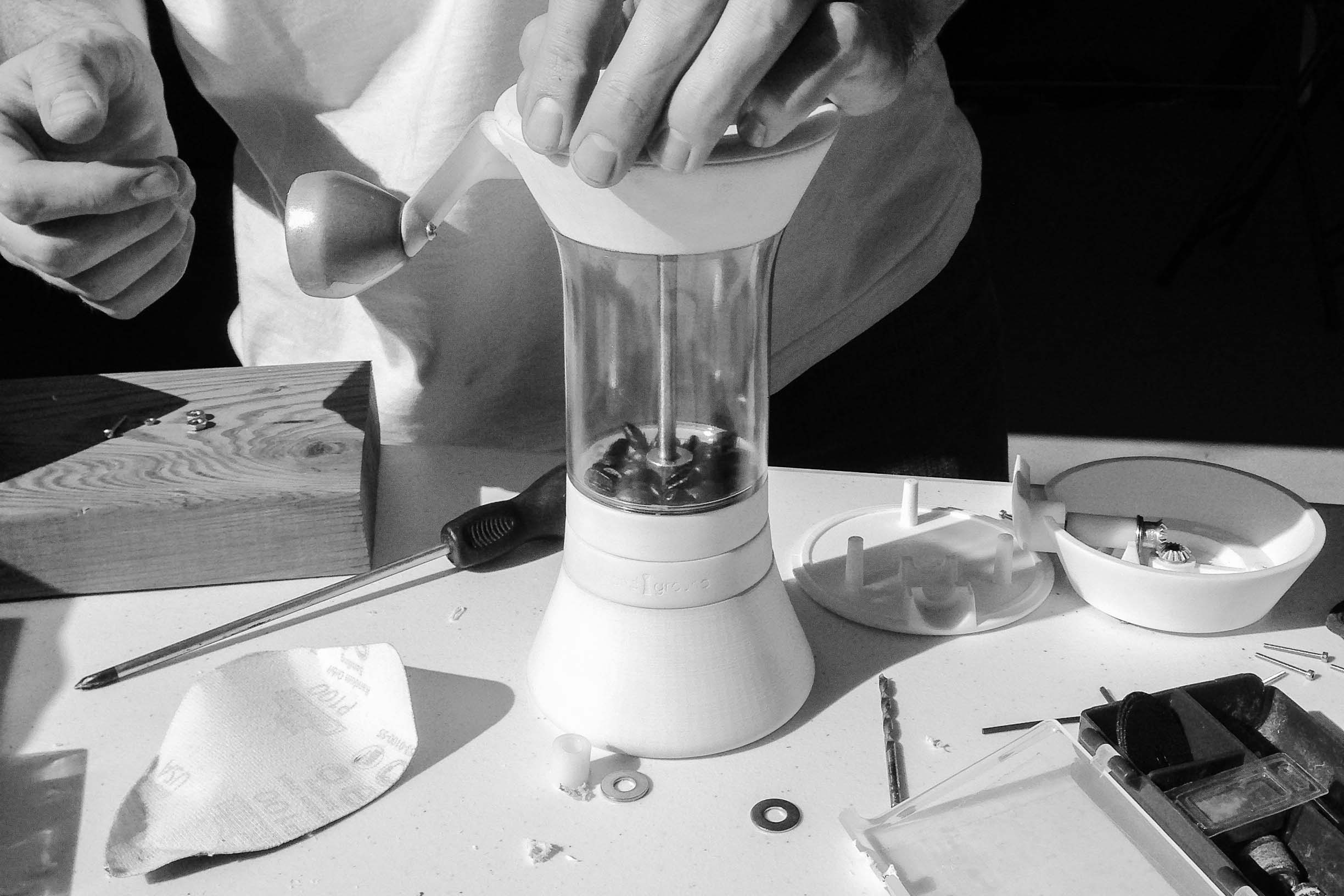
Another example of objective reality trumping community preference is the selection ring, a unique feature on this coffee grinder that allows you to select the coarseness level you want for your beans.
Daniel recalls owning a manual coffee grinder that had a “wingnut on threads” that you would spin, and that would raise and lower the mechanism to change the coarseness. “The problem,” he says, “was that it took a bit too long to get it to just the right level and then, you couldn’t replicate the settings. You’d grind, adjust, grind, adjust again, and finally get it to the size you want, say for a pour-over, but then your roommate would come in and use it and change it to something else because he likes French press. You couldn’t save your settings.”
It struck Daniel and Brandon to replicate the concept of a camera lens, with its f/stop and millimeter rings that you could click into position. The community loved the idea, and asked for 20 different coarseness levels. Each step would give a 100-micron (0.1 mm) change in grind size. But in creating the prototype, the founders saw there wasn’t enough physical room for 20 steps, and the device would skip a step or two.
“We needed a good solid click,” says Daniel, “So we cut it down to 15 steps. And we told Team Handground about it. We told them the grinder’s going to have 15 not 20 steps and we explained why we made this decision. That kind of transparency seems to pass just fine with the community. Because they know it’s in their best interest.”
Passion and Community: a Natural Mix
Steve Jobs also once said, “Every good product I’ve ever seen is because a group of people cared deeply about making something wonderful that they and their friends wanted. They wanted to use it themselves.”
Passion, in other words, is priceless.
“I think that coffee is unique in the passion that people have for it,” says Daniel. “It would be hard to do a campaign like this for kitchen utensils. Brandon and I are also coffee fanatics. Coffee is this really deep rabbit hole and there’s so much to learn.”
Handground has certainly learned a lot from the community it has taken such great pains to nurture and grow. But all that effort has paid off in building a passionate customer base that feels directly invested in the products Handground makes and markets. And from what we can tell, the company has no intentions of letting that garden lay fallow.
