Time to read: 7 min
What’s tougher than creating a new product in a well-established market? Creating a new product in a well-established market that happens to be not sexy, and for some even taboo.
We’re referring to the wheelchair. Historically, the wheelchair has been associated with disability, old age, or some kind of infirmity. While multi-billion dollar empires have been built around completely new playthings like the iPhone, the tablet, and social networks, the wheelchair has plodded along, manufactured primarily for the medical market, completely ignored by the creative genius of designers and entrepreneurs.
Enter WHILL. Sparked by a desire to help a friend, it’s coined as a “personal mobility device” rather than “wheelchair,” upending a paradigm that has been all but carved in stone.
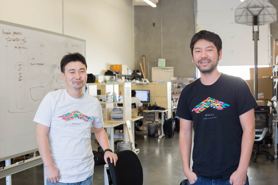
We talk to WHILL’s marketing director Chris Koyama about redesigning a decidedly uncool product and changing the culture and mindset of personal mobility.
Changing a Mindset
There’s nothing like an entrenched mindset to govern the health of a market (among many other things we won’t get into). The wheelchair industry, explains Chris, “has always treated people [who need mobility devices] like they’re patients. The attitude is, they’re disabled, and that’s why wheelchairs are designed like a medical device.”
One problem, he shares, is that the people who benefit from a mobility device, whatever their reason for using one, have never been treated like a consumer. No one thinks about their personal, individual tastes and preferences. About the features and functions that would make work and play easier and more enjoyable. About how the “product” can help improve, or even inspire, their lives.
The other issue is that the wheelchair does not quite fit, or respond to, a lot of users’ lifestyles. Just because you cannot walk, or have trouble moving around on your own, doesn’t mean you can’t go outdoors or live your life and routines like anyone else.
In this sense, the companies manufacturing powered wheelchairs are certainly not a part of the solution: they’re churning out the same old models, the same old designs: clunky, unsophisticated, difficult to maneuver.
A World of Difference
So what’s the big deal about WHILL’s Model M? At first glance, it does the same thing any other wheelchair does: it transports people from point A to B. But there’s a lot more here than meets the road:
First, in terms of design, when you put Model M next to a traditional wheelchair, no words need be said. Unlike the rather unattractive wheelchairs, Model M is sleek and sophisticated. It employs the same minimalist elegance that a modern car does.
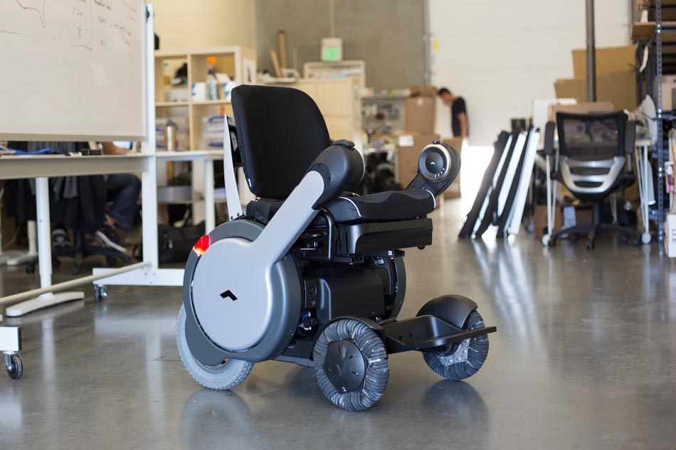
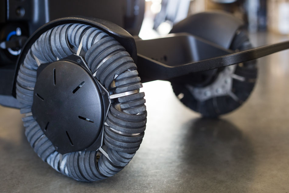
In the functionality and maneuverability area, Model M wins too. It has omnidirectional wheels in the front that give it a much tighter turning radius. With their large circumference, the wheels can clear sidewalks or obstacles up to 3 inches high (traditional powered wheelchairs can only do 1 inch). And with 4WD built in, Model M can go across grass and bumpy terrain.
Chris adds the company is constantly innovating and working on different options and features. “People need different types of support,” he explains. “Different people have varying ability and strength in their upper body, core, or lower limbs, so we need to account, and design, for that.”
As far as technology is concerned, the WHILL team designed a special mobile app for its Model A, the personal mobility device built for everyone regardless of physical ability. The app connects to the Model A and allows users to control it remotely. “So when you wake up,” says Chris, “you can remotely navigate the device and bring it over to your bed. Or, if you’re at a friend’s house, you can park it on your own, without having to ask someone to do it for you. It makes you much more independent. This is simple technology,” he adds, referring to the Bluetooth interface Model A uses, “that has simply never been utilized in this sector.”
No Shrinking Violets Here
Another way that WHILL is changing the idea that people in wheelchairs are completely helpless is the device’s ruggedness. Model M is waterproof compliant with IPX4, so you could go out in rain. “Really hard rain,” clarifies Chris. “We wanted to make sure an active person can use WHILL without sacrificing their lifestyle.”
He doesn’t recommend deliberately rolling the device through mud, however.
As for the battery, WHILL made the decision to stick with regular mass-produced batteries, the 12-volt kind typically used in powered wheelchairs. “We considered lithium instead of the usual lead acid. But the cost and burden on the user would have been too steep if we’d built non standard batteries,” says Chris. “With these, you charge the device every night, and that gives you 12 miles per charge.”
Design Intimate and Functional
The WHILL founders have almost no medical background, and that’s a good thing. CEO Satoshi Sugie used to design cars at Nissan. CDO Junpei Naito was a product engineer at SONY. Only CTO Muneaki Fukuoka comes close: he was a medical device engineer at Olympus (yes, the camera maker).
Considering WHILL is a personal mobility device, the automotive influence in the founder makeup is a big plus. People have actual relationships with their cars: they name them, they show them off to friends, they take care of them like family. That’s the kind of relationship the WHILL team hopes to inspire with their product.
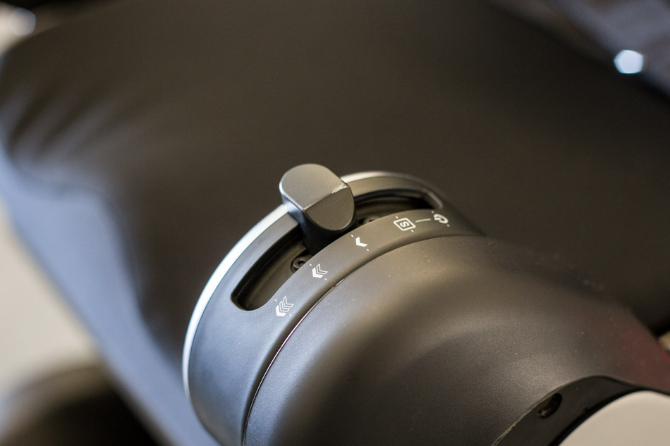
“The auto industry influence has been a big part of our R&D process,” says Chris. “Satoshi wanted a design that suggested forward movement, so that’s why the arms are facing upwards, in a positive direction. When you put your hands on the controller parts, you’re in an active “driver” position instead of the passive position you’re in when someone is pushing you in a wheelchair. It’s active design language from a form and user standpoint. You feel like you’re moving yourself forward instead of waiting for someone to move you, or to get out of the way for you. That makes you feel more outgoing and to be more engaged socially.”
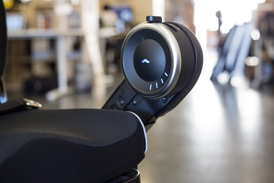
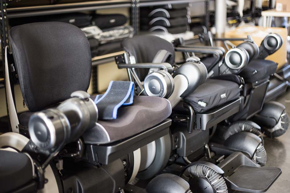
A wheelchair—or any personal mobility device—is a “very intimate” thing, shares Chris. “You’re in it all the time. So everything from ergonomics to material selection was really important to us. The materials we use are less absorbent, and the side panels are coated, not textured, so that dirt can’t get in as easily and it’s easier to wipe off. We also had another advantage—our people had built consumer electronics before so they knew which materials to use and how to integrate user feedback into the next prototype.”
They tested different materials for the seat cushion, the back support, even the switches. All in all, WHILL went through six fully functioning prototypes in two years, with a team of just five people.
When Your Users Speak, Listen
It wasn’t just about the right design and the right materials; the team also did a lot of testing. They spoke to hundreds of users in person: they visited hospitals, veterans’ associations, and senior centers. They talked to physicians and therapists, and walked around randomly looking for people. The key, says Chris, was not being shy about asking questions.
“We learned a lot by talking to people. And some of those people we met are still helping us out today.”
Signs that their efforts were working came early. At the 2011 Tokyo Motor Show, where they debuted one of the first prototypes, people really responded. “People in wheelchairs appreciated seeing innovation happen, at long last, in this industry,” Chris shares with us. “They felt like they hadn’t been able to enjoy the fruits of innovation in the personal mobility sector the way they did in other areas, such as the smartphone industry.”
But why a motor show rather than, say, a wheelchair industry conference?
“Because it’s a mobility device,” says Chris. “It’s transportation, not a crutch—we envision a world where anyone can use this device, whether they ‘need’ it or simply want it.”
When WHILL did the motor show again in 2015, to their surprise more able-bodied people test-drove the device than disabled people.
The excitement seems to be spilling over into everyday life. Users are reporting that instead of avoiding them or offering to help, able-bodied people are approaching them with true curiosity and wonder.
“The best stories we hear—and this is a trend we’re starting to see—is that the way able-bodied people approach our users has changed drastically,” shares Chris, smiling. “It used to be, ‘Oh hi, do you need help?’ Now it’s like ‘Wow, this is cool, where did you get that?’ It’s as if they were talking about a cool new sneaker. That never happens with the traditional wheelchair.
WHILL even sends out a team at delivery to ensure the configuration is just right for each customer, and to educate them on how to work with and maintain the device.
Two Options are Always Better Than One
WHILL has two products. The Model M, an FDA-cleared medical device, and the Model A, which anyone can buy. The difference is important. The Model A is not a wheelchair, as far as the medical sector is concerned. It’s a personal mobility device plain and simple. That opens up the floodgates to a much bigger market: while wheelchairs were designed strictly for disabled individuals, requiring FDA approval to be prescribed by physicians, the WHILL Model A is designed for anyone who wants a comfortable way to get around that doesn’t happen to be a bicycle, scooter, skateboard, rollerblades or any other method of transportation that requires leg power (and yes, simply standing on a motorized scooter still requires leg power).
And that brings us full circle to the very thing that drove the WHILL team to build an entire company around: the simple idea that anyone should have access to all the mobility they can get their hands on.
To the users who are now the centers of attraction in their shiny new machines, the WHILL team must feel like superheroes, we suggest. Chris laughs. “Well, we were in the Batman v Superman movie recently. They needed a high-end mobility device for one of the characters.” He won’t say which one. But hey, if it’s good enough for Batman…

